The new version of SharePoint comes with some new look and feel features. This article shows a couple of them.
Site actions
The Site Actions menu seems to be disappeared but actually it has been replaced by the following icon:
![]()
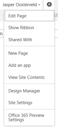
This will be confusing for users who worked with the previous version of SharePoint.
View all site content
Also this menu has been redesigned:

I really like this! It looks clean. I like the big icons (probably also for touch screen purposes) and the font. Two thumbs up!
Ribbon
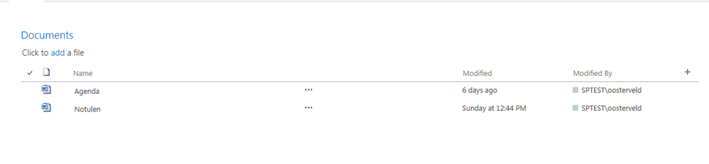
The following screen shots are taken from a document library ribbon:

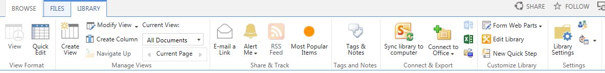
The tab Files is the new name for Items. There are some new icons, such as New Folder and Library Settings, but overall it does look the same.
Create a column
The pop-ups, such as for creating a column, also looks more clean:

This is kind of the overall look and feel, some blue and a lot of white. This does not really matter because most companies have their own corporate branding.
New app
The words lists and libraries have disappeared, it is all about the apps now:
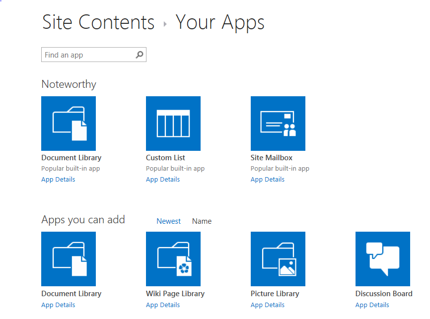
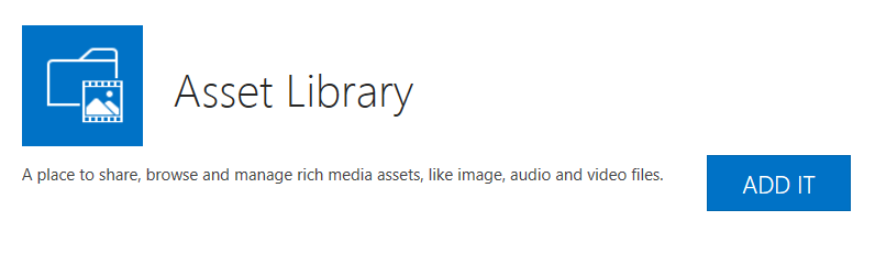
The screen for creating new apps looks similar to the view all site content view. You can click at Details to get some more information:
 I don’t like it comes in the same window and you lose every sense of navigation but again, I really like how clean it is. No nonsense, just straight to the point.
Focus on content
The last part of this article I would like to dedicate this little icon:
![]()
What happens?
Before

After
The top navigation and quick launch disappear! This must be for mobile devices to save up space? You tell me 
That was it for now! Keep an eye out for more SharePoint 2013 articles to come!

Do you know if the “Focus on Content” can be automatically invoked by a querystring parameter?
Hi Nutrino,
Unfortunately I don’t know the answer to your question. Please keep me posted when you find out 🙂